
What We're Framing Now: Rosa
For our next installments of What We’re Framing Now, we’re heading to Artists Frame Service – River North, where creativity doesn’t clock out at the end of the day.
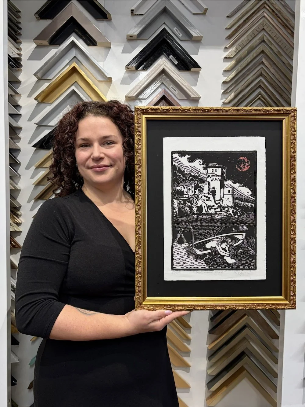
This time, Rosa brings us along on a dream trip to southern Italy — and into the thoughtful, nuanced decisions that transformed a treasured linocut print into something personal, unique and visually striking. With a designer’s eye for proportion, undertone and movement, she leaned into moonlight, mythology and a hint of drama to create a frame that feels as intentional as the artwork itself.
What piece did you frame?
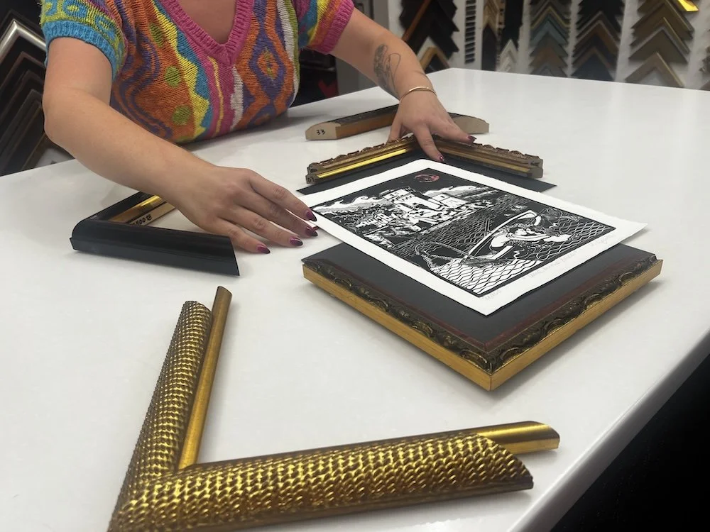
I framed a linocut print that I bought when I was in southern Italy. I told myself I wasn't going to buy any tourist art while I was there, but this piece made the cut.
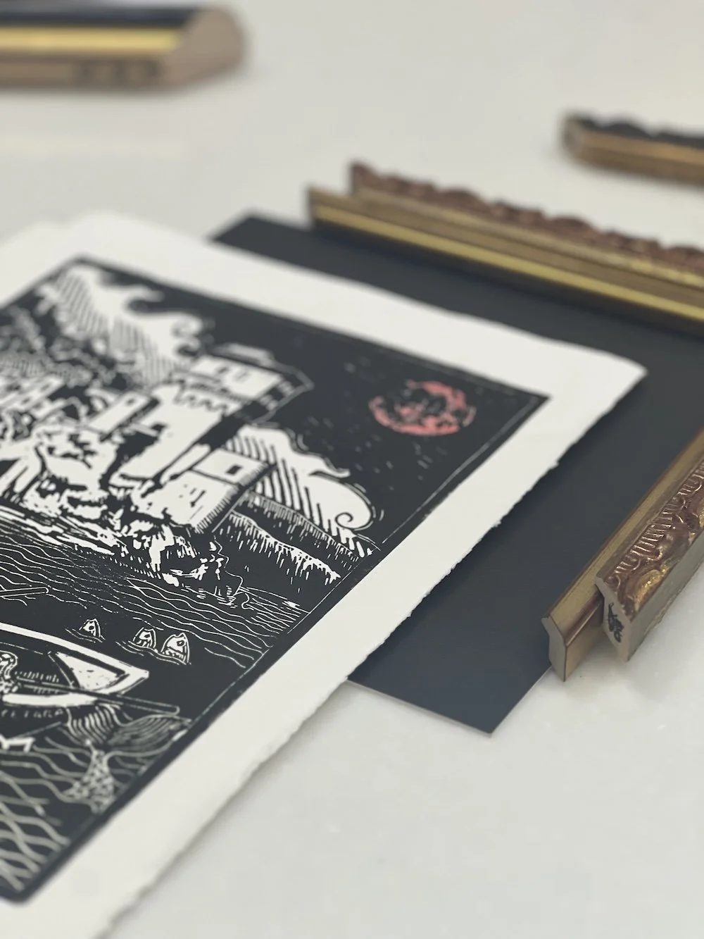
I found it in a little grocery shop in Vietri sul Mare, so it felt very original and not like a replica of something I've seen before. It's called "Une Boune Pesce" by Vincenzo Liguori.
What do you love most about it?
I love mermaids and the moon, both of which it features. It's also a nice way to commemorate a trip of a lifetime. I've wanted to go to Italy since I was a teenager taking AP Latin!

Why did you choose the framing combination you did?
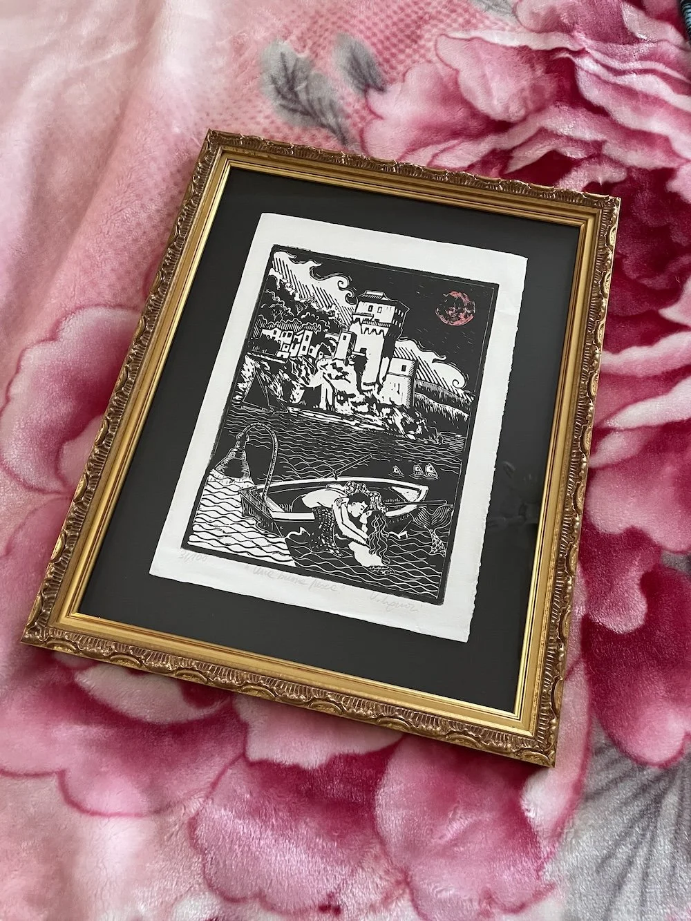
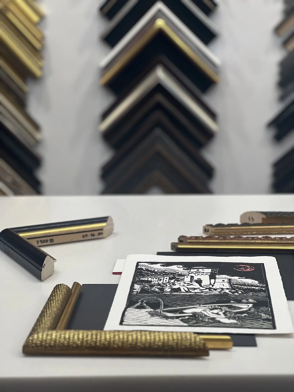
I knew I wanted something from the "Rococo Ruffle" line because of the way it reminds me of waves. At first, I thought I'd want the black and gold version, but when I looked at it with the print, it was just too harsh.
Though, when I looked at it with the red and gold version it was a hit because of how the red complements the moon. Of course, I made sure to look at other frame options as well for good measure.
I floated the print on dark matting to show off its deckled edge. First, I tried it with our standard black mat, but that was also too stark of a contrast, so I went a shade lighter and chose After Dark instead. I think it complements the ink in the print nicely, and it's also fun when the mat color name corresponds with a piece.
Any tips or tricks from how you framed this piece?
I was unsure about the amount of float space because I typically prefer a smaller float margin. But you always want to balance the amount of matting you see with how wide the frame is and the border on the print. Having too similar of a frame width, mat margin and artwork border can begin to look stripey. Customers always ask, "what is the standard?" but there really isn't one. It's just a visual thing.
What's your favorite part about how it turned out?
I love how the inner frame makes it look like an entirely different, unique frame. The "Tiny Oro Brancusi" frame was the perfect inner frame because it has a hint of red in it due to the underclay. Overall, I'm thrilled with how the piece came together!
Where will you display it?
My bedroom, where I have many other metallic frames and artwork that features the moon. This one is flanking my bed, opposite a piece by Olly Costello of an older woman looking up at the moon cycles.
If you’ve had a dream trip of your own to frame come see Rosa in River North or visit us in Highland Park or Lincoln Park!